EA Sports \ NHL26 \ Menu Refresh
UI, UX, Product Design
My team was part of an extensive project to redesign and implement a new menu and navigation system for the Hockey Ultimate Team (HUT) game mode in the NHL26. The goal of this project was to reimagine how we can deliver a refreshed and engaging player experience that can map to our product pillars for NHL26.
My role in this project included partnering with Player Experience Research (PXR) partners to conduct and dissect testing sessions, researching on best UX practices in the industry, designing wireframes and high fidelity UI mockups, prototyping interaction concepts, and supporting software engineers with the implementation process.
Credits:
Jake Kyle / Matt McTavish - Game Design
Emiliano Gaeta - UI Engineer
Edwin Tang / Amrit Malhi / Breanne Lewis - UX Design
Jhim Verame - UX Research
Research Insights.
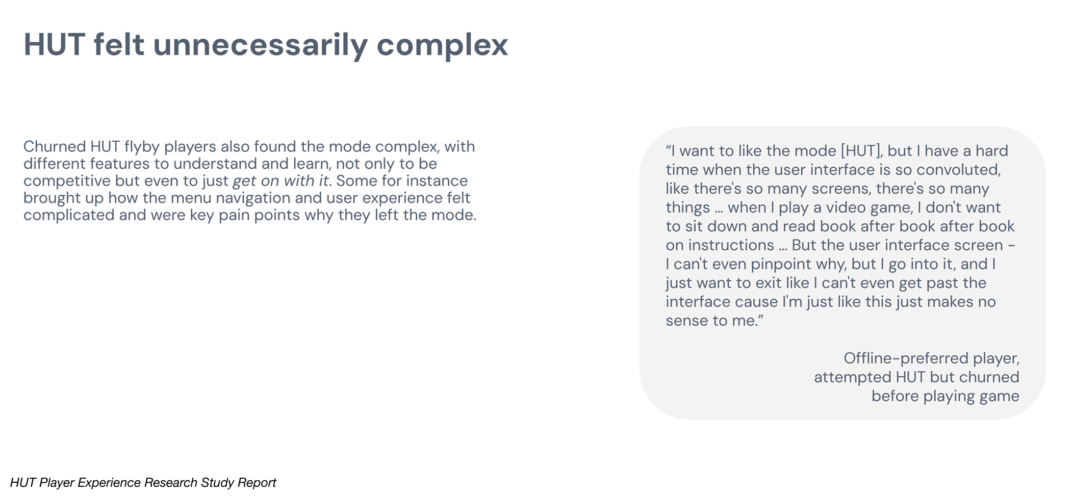
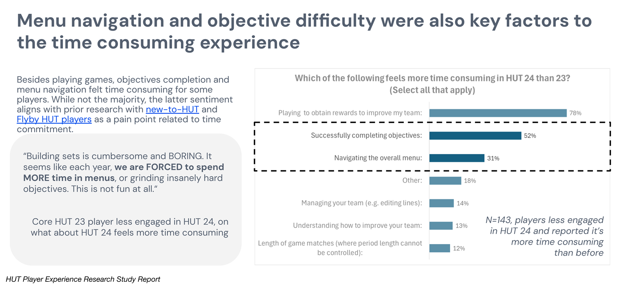
Research showed a growing shift toward a more casual HUT player base seeking a friendlier and more approachable experience. New users were frequently overwhelmed by onboarding and menu complexity, making the first-time user experience a major friction point. Additionally, our existing players also felt that HUT’s visuals and UX had grown stagnant with little meaningful change year over year.
Overall navigation was described as tedious, with core tasks like moving between hubs, checking objectives, collecting rewards, and visiting the store feeling like a chore rather than part of the fun. These insights made it clear for our team on how we might approach the problem.
Discovery.
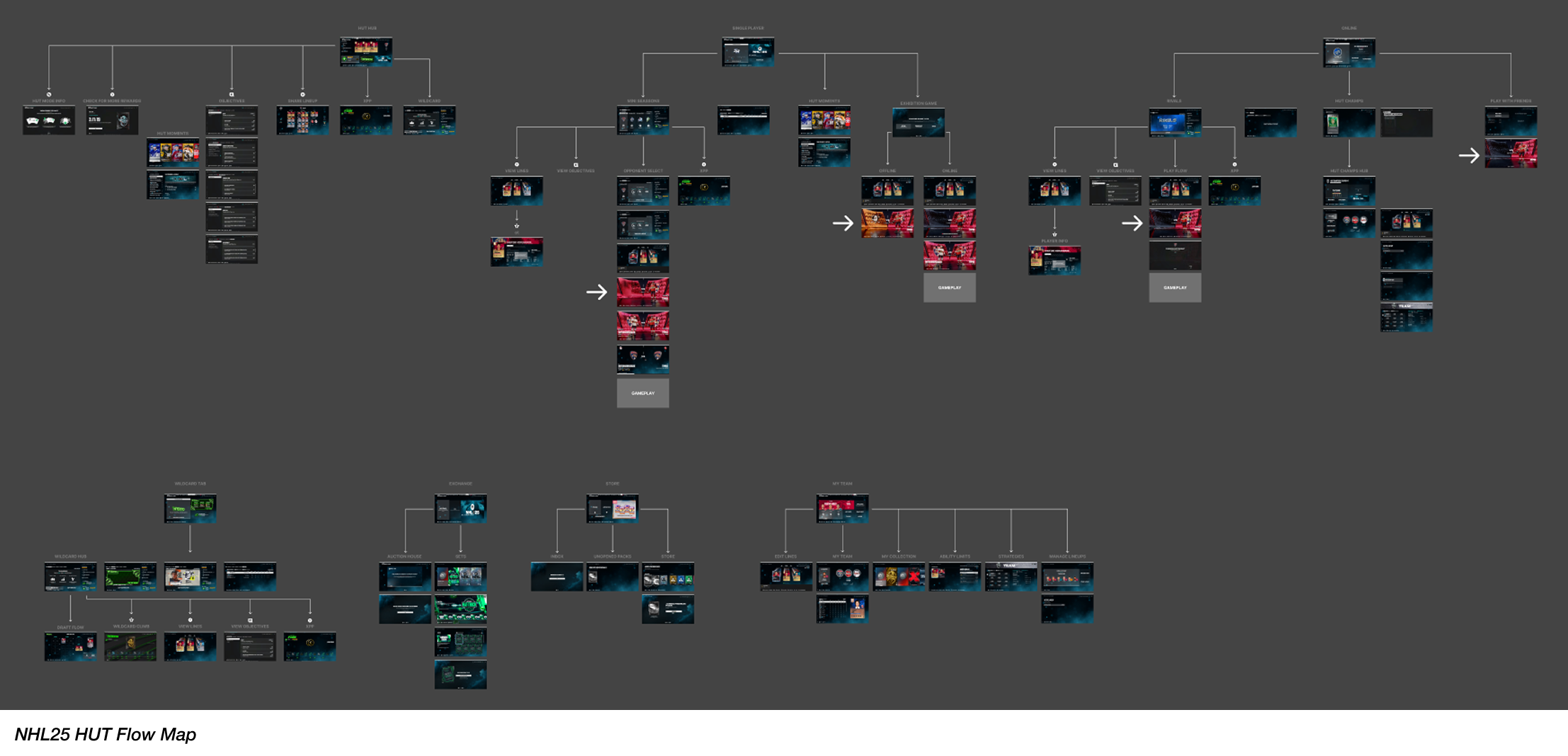
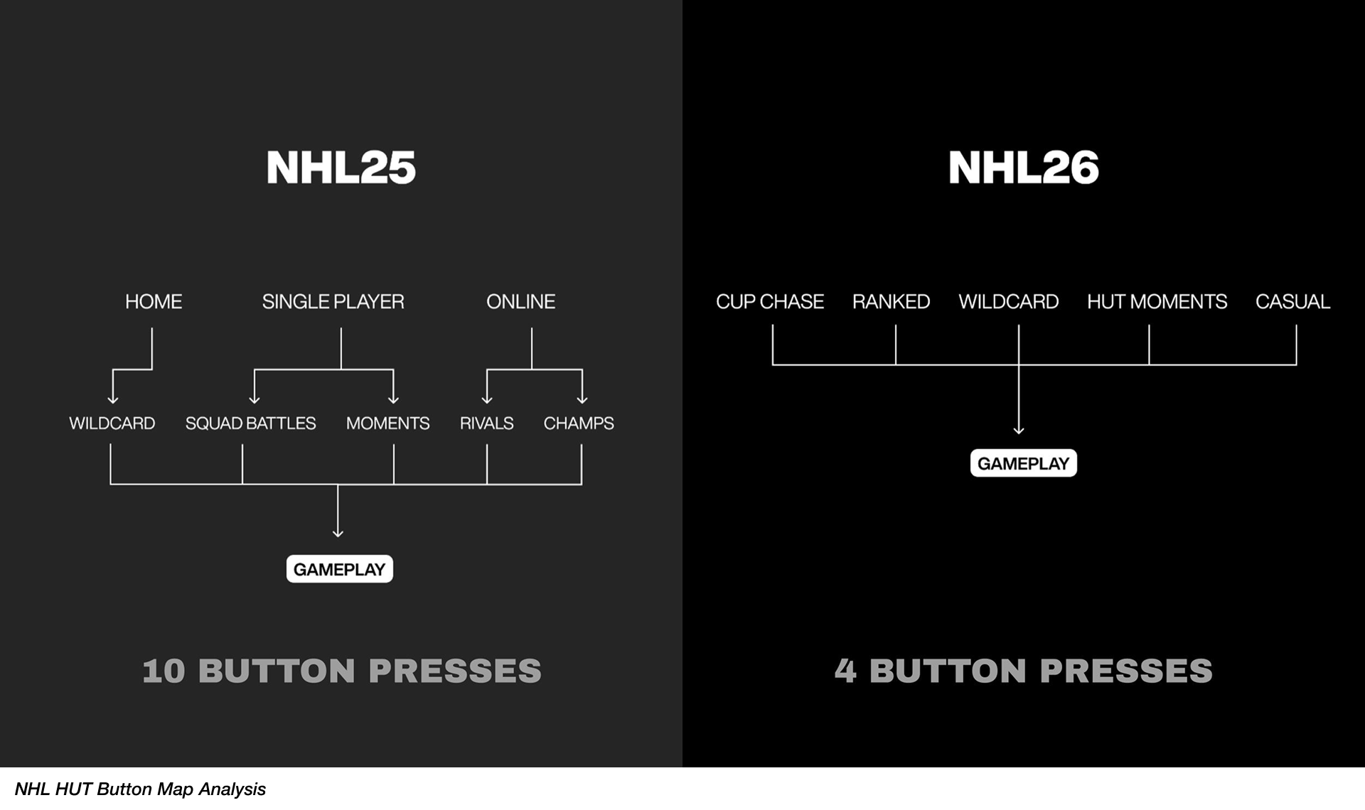
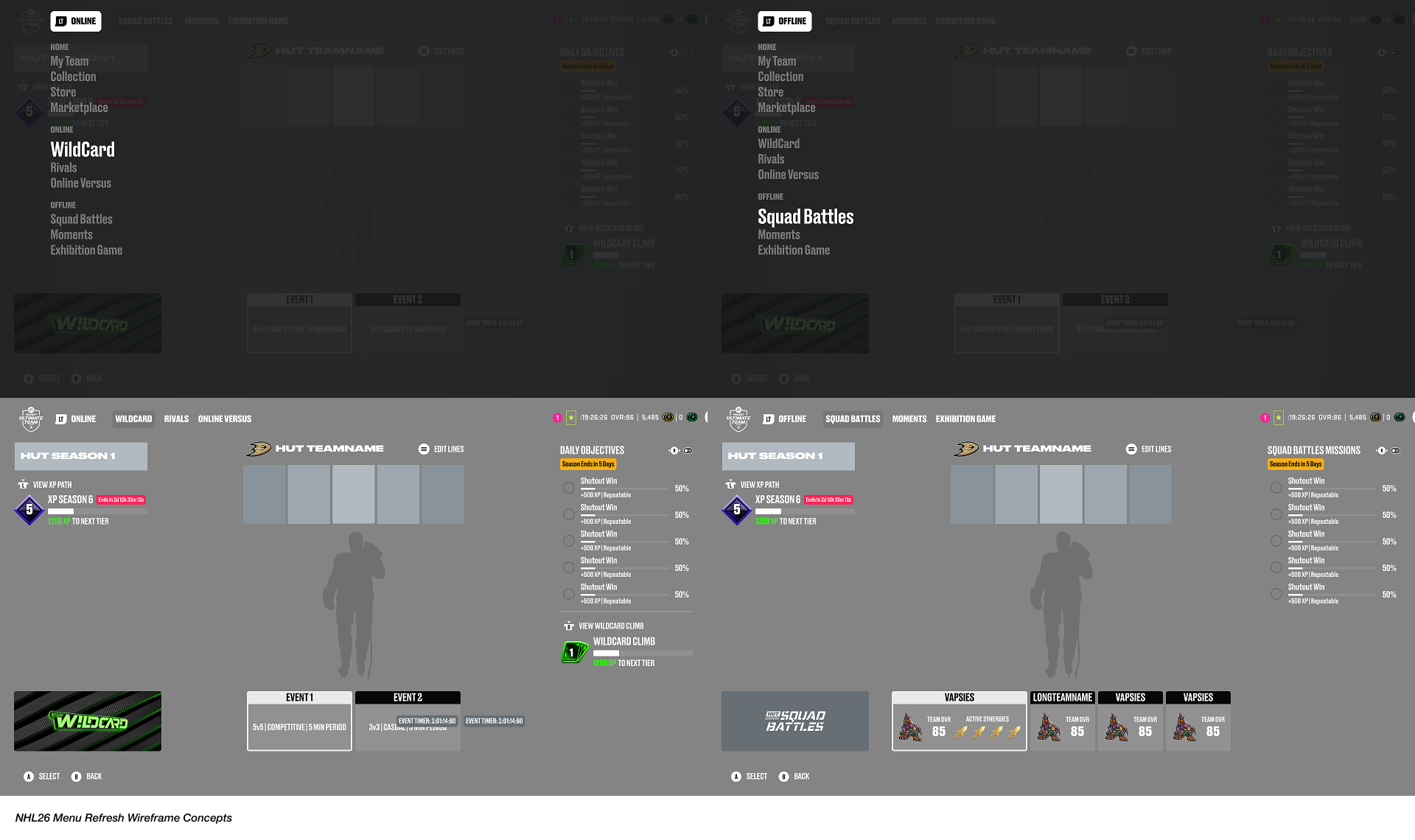
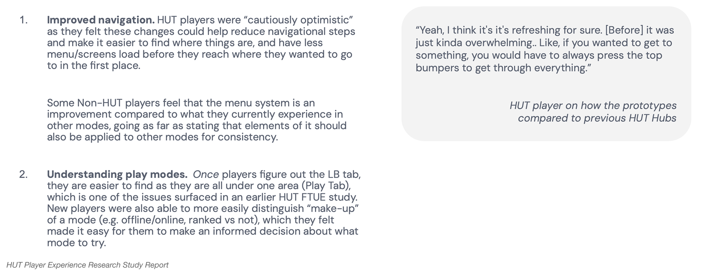
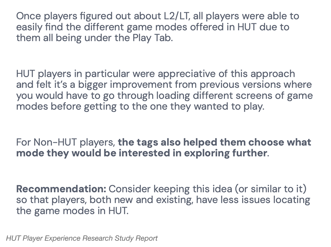
Through a detailed review of our menu systems across previous NHL titles, we identified two persistent interaction issues: the unclear organization of play modes, and the excessive button clicks required to reach gameplay. These friction points directly contributed to players feeling of a “chore” or the “tedious” nature to HUT.
Design Process.
To explore solutions, I began by conducting competitive analysis across both EA titles and other leading sports games to understand modern navigation patterns and interaction best practices. From there, I produced a wide range of wireframe concepts that reimagined the structure of our play hubs and collaborated closely with fellow UX designers, Game Designers, and Producers to test variations, discuss usability, and refine what felt intuitive and efficient.
A key exploration during our design process was the introduction of a new dropdown menu, accessible through a dedicated left trigger interaction on console controllers. This interaction provided players with a quick and easy-to-access way to surface gameplay options without navigating deep into menus.
As part of our broader goal to lower the barrier to entry, we re-evaluated how gameplay options were organized and shifted toward more intuitive, player-friendly naming systems - such as Online vs. Offline, Casual vs. Competitive, and Player Versus Player (PVP) vs. Player Versus Computer (PVC). By restructuring options around clear, easily understood categories, we aimed to simplify the decision-making by creating a more welcoming experience for both new and returning players.
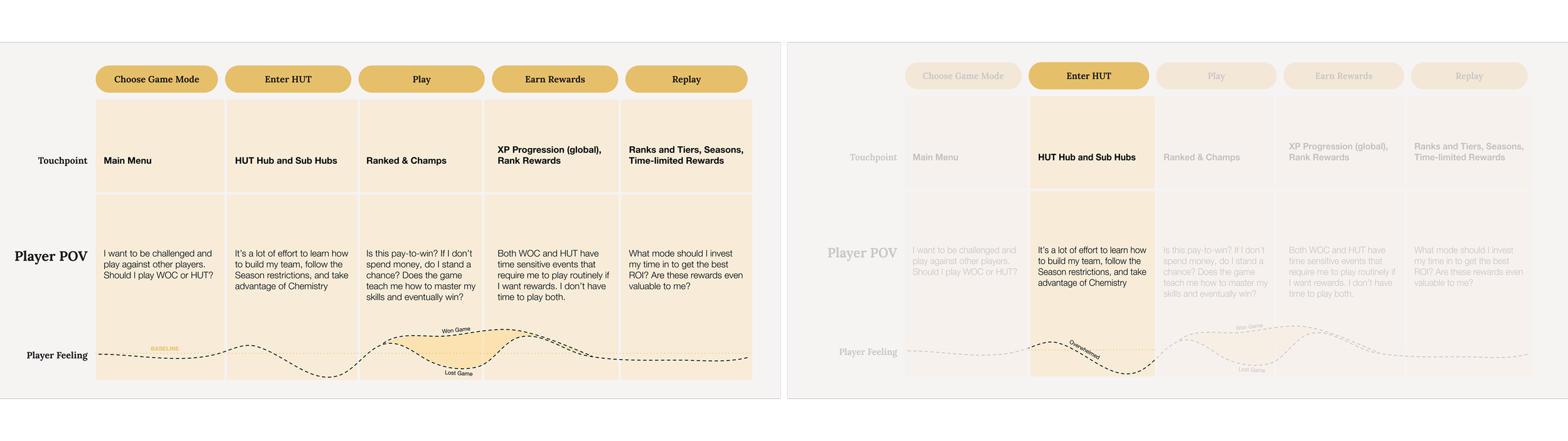
To also address some friction points in our First Time User Experience (FTUE) flow, we also explored how players would prefer to ‘land’ in HUT and what would make the initial moments of the moment more approachable yet allowing them to get into the fun of gameplay quickly.
We experimented with a lightly guided click-through tooltip system that introduced new core features without relying on intrusive pop-ups or heavy information dumps. From there, we evaluated how this FTUE flow should transition players into our new Play Hubs by partnering with PXR to test several suggestions we had to understand which entry point would be best balanced for clarity, approachability, and motivation to play.
Concept A, place users directly into the Play Hub. Or Concept B, utilizing a familiar or more welcoming homepage-style discovery interface.
Prototype Concept A
Prototype Concept B
Visual Exploration.
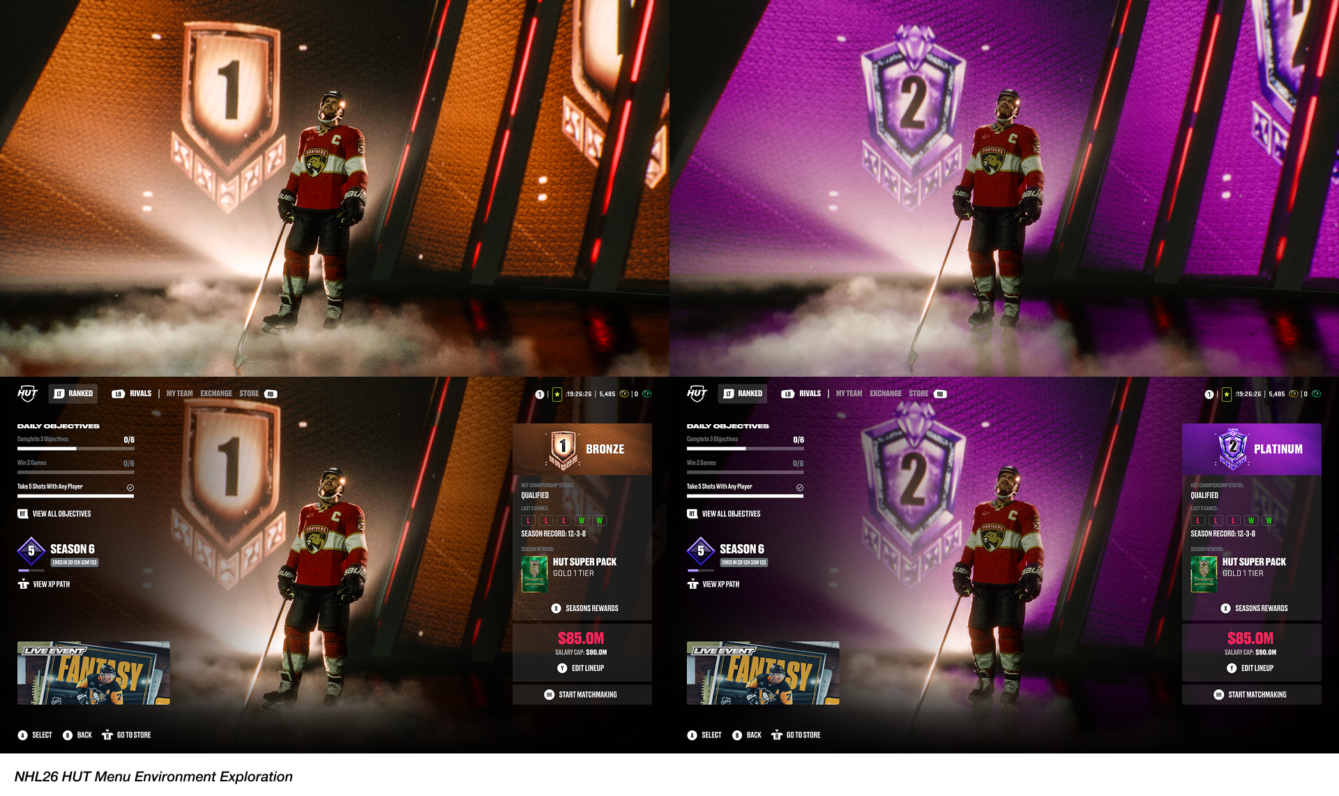
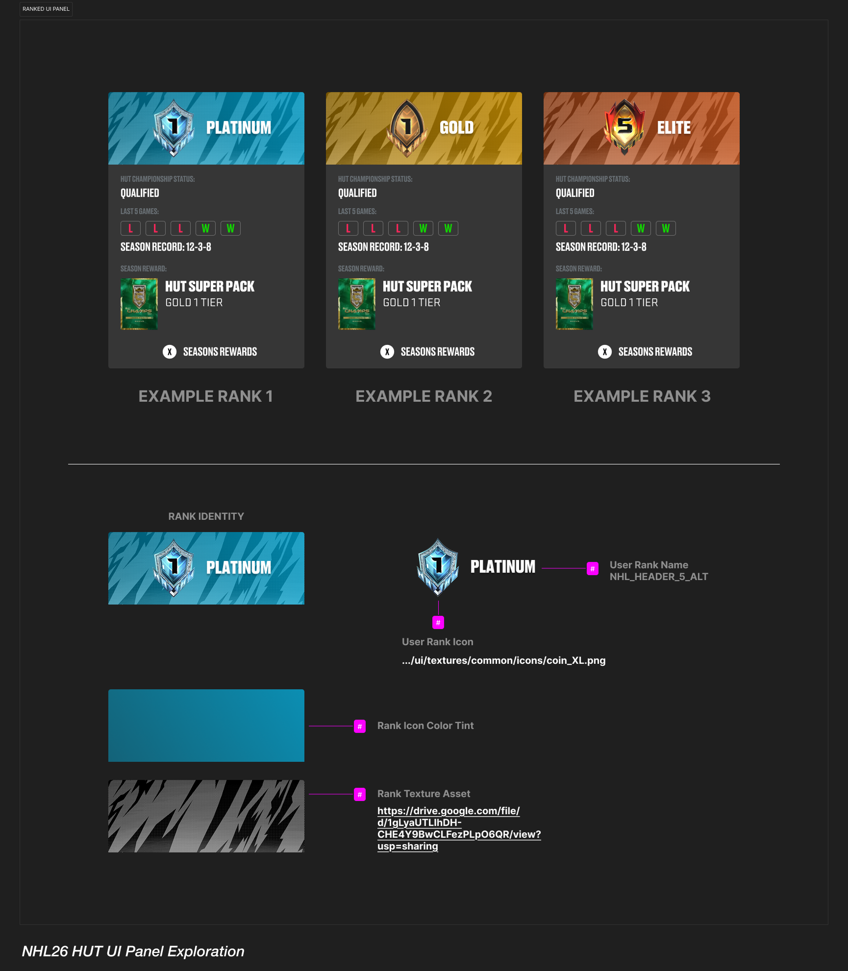
Beyond UX improvements, an important part of the process was identifying opportunities to elevate the overall visual experience. How might we create a more visually exciting and rewarding environment the moment players enter the mode?
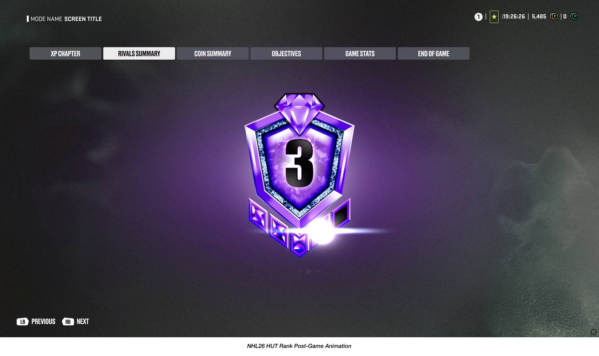
To explore this, I experimented with introducing more player-centric visual elements such as graphic treatments in the right UI panel that highlight rank progression, and also worked directly in our proprietary game engine tools to discover how our new Hypestage environment technology could be used to stage a prominent captain avatar.
These explorations aimed to bring more energy, personality, and a sense of ownership to the player’s landing experience.
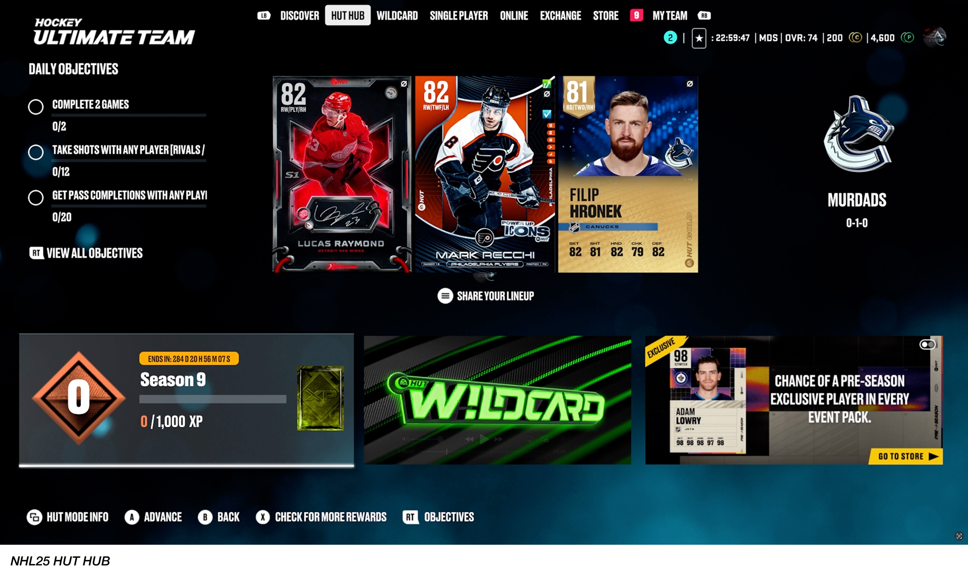
NHL25 HUT HUB In-Game Capture
Overview.
Looking back at insights from previous Player Experience Research (PXR) data, it became clear that building NHL 26 required a renewed focus on what matters most to HUT players. These learnings helped us define one of our priorities in NHL26 to Lowering Barrier To Entry by improving the ease of use navigating menus with a refreshed User Experience.
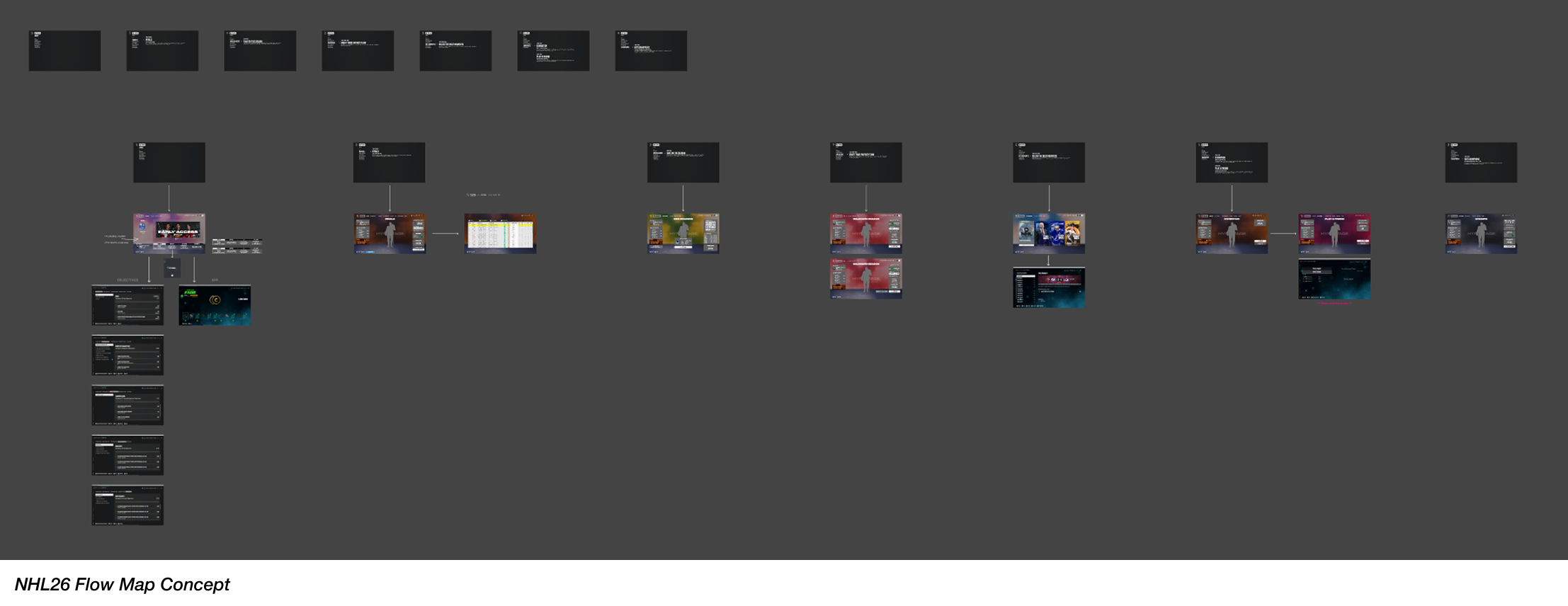
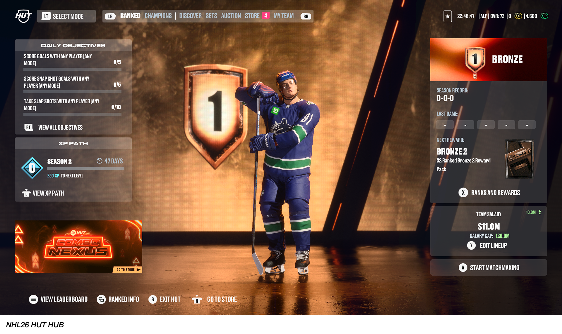
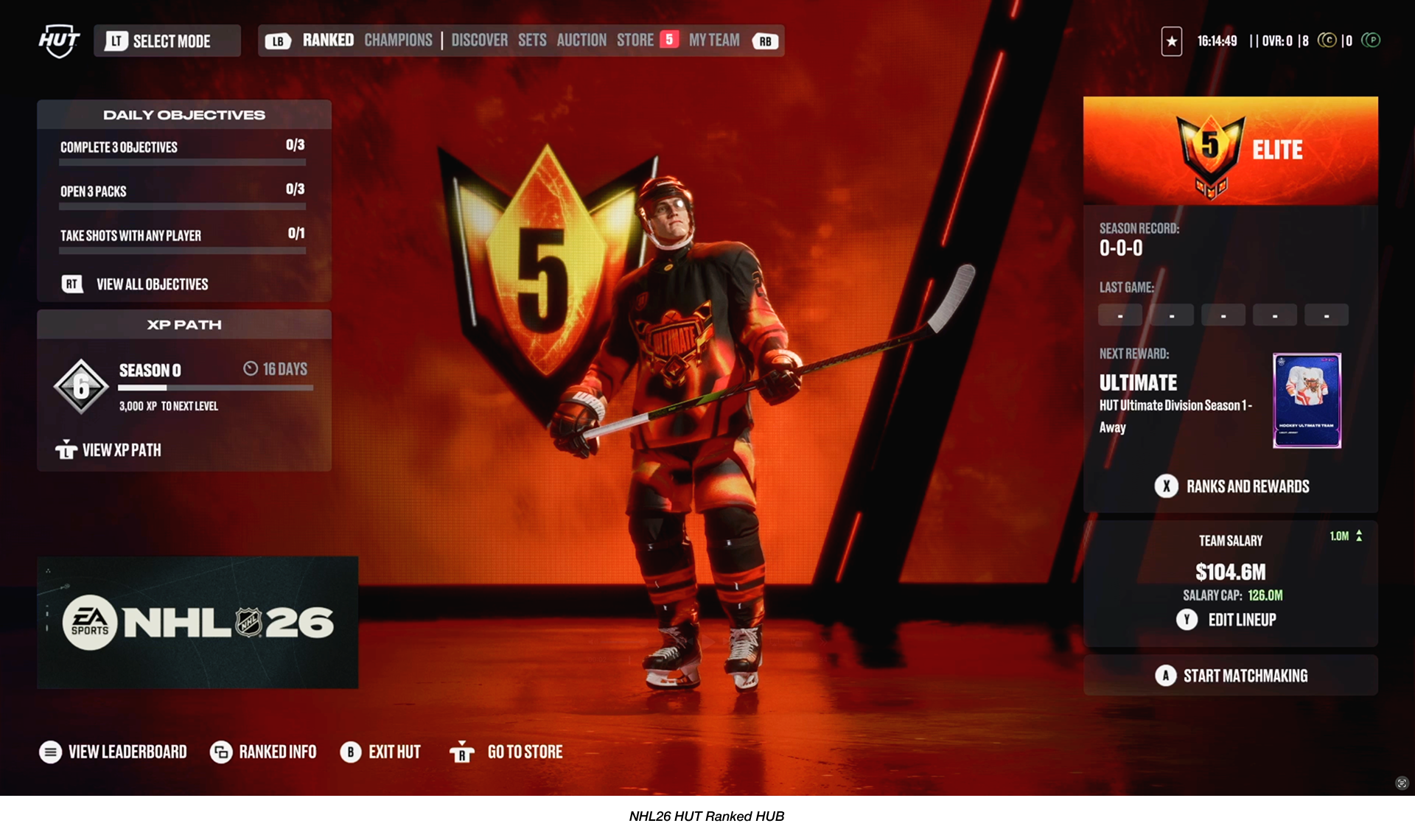
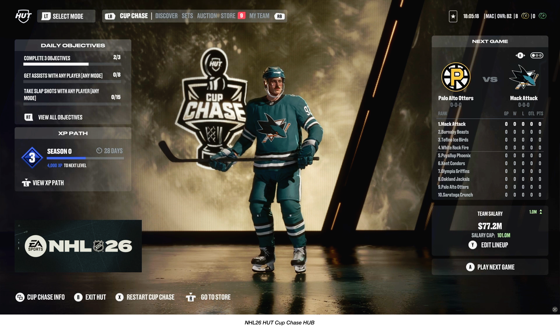
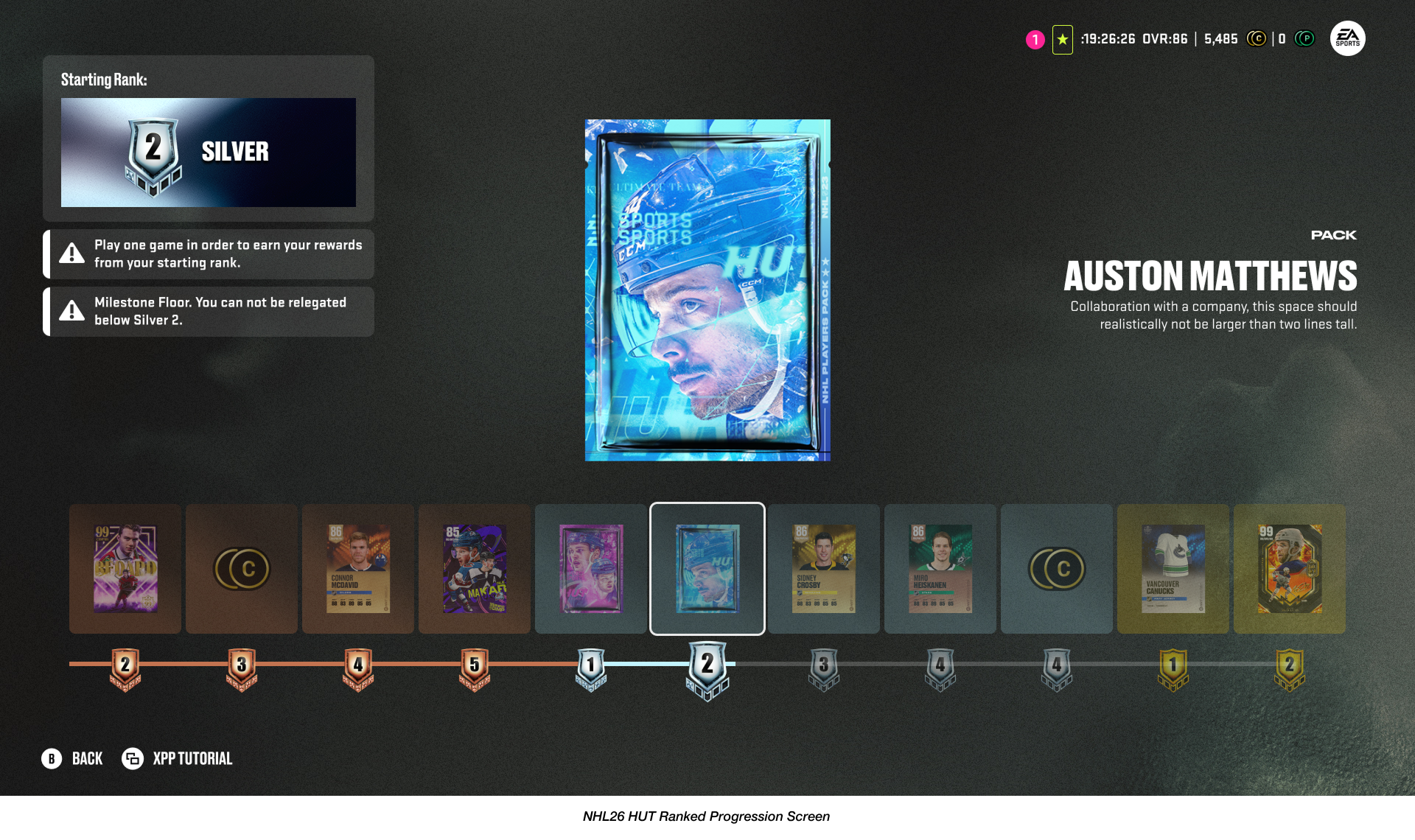
Final Designs.
Reflecting on the evolution from previous titles to NHL 26, I’m proud of what the team accomplished within a single production cycle. Even after release, I continued partnering closely with our Community Manager to understand player sentiment in what is working well with our users, while also gathering feedback for future iterations.
This redesign represents an important first step, and we see it as one of many building blocks that will continue shaping and elevating the overall Player Experience in HUT moving forward.

HUT Menu Refresh Walkthrough Begins at 0:33